Neardeal
Branding
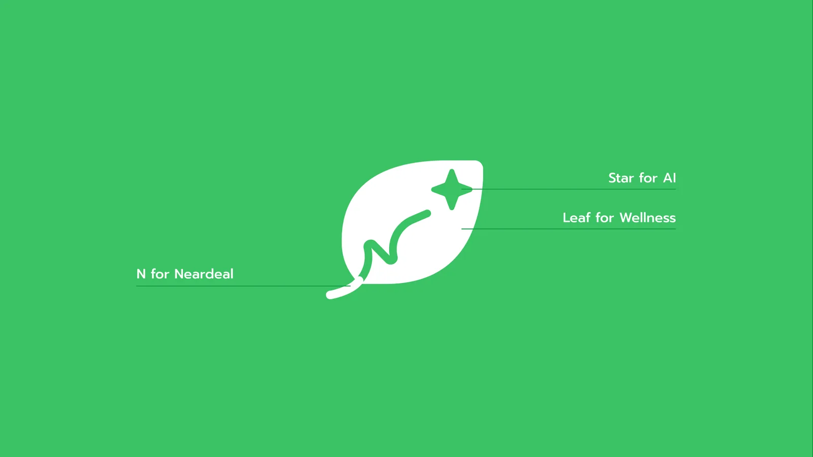
The NearDeal logo represents a journey toward health and balance, guided by innovation. Our story begins with the simple shape of a leaf, symbolizing wellness, nature, and growth.
Woven into the leaf is the initial "N," which also traces a upward-trending path. This curve represents the unique wellness journey each user takes with NearDeal—a personalized, rising line of progress.
This path points directly to the small star at the peak, representing the guidance and optimization of advanced artificial intelligence. The core feature of Neardeal wellness booking platform experience to reduce staff workload on repetitive task and provide unique insights.
The Challenge
Fragmented Operations & Value Friction in Premium Wellness
The premium beauty and wellness sector lacks a dedicated digital ecosystem capable of delivering a high-end consumer experience while solving complex operational bottlenecks for merchants.
To capture this market, the platform had to solve two distinct architectural problems:
The Consumer Friction (Value Perception)
High-end users expect a frictionless, premium booking experience to justify premium tier pricing. Meanwhile, merchants lose significant revenue during non-peak hours due to rigid, static pricing models.
The Merchant Friction (Operational Bloat)
Traditional booking software is cumbersome and fails to support business growth. Small-to-medium wellness merchants struggle to manage complex schedules while simultaneously trying to produce high-traction marketing copy and edit authentic, real-world promotional video content.
The Systemic Solution
NearDeal bridges this gap by introducing a data-driven, two-sided marketplace architecture:
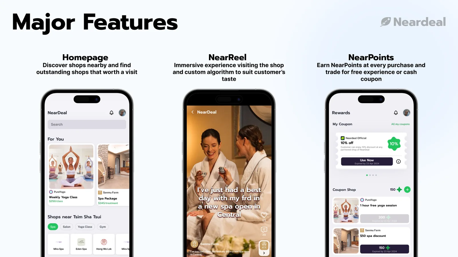
For Users
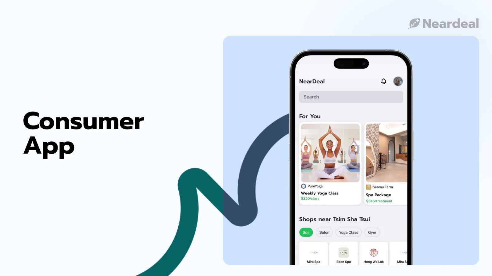
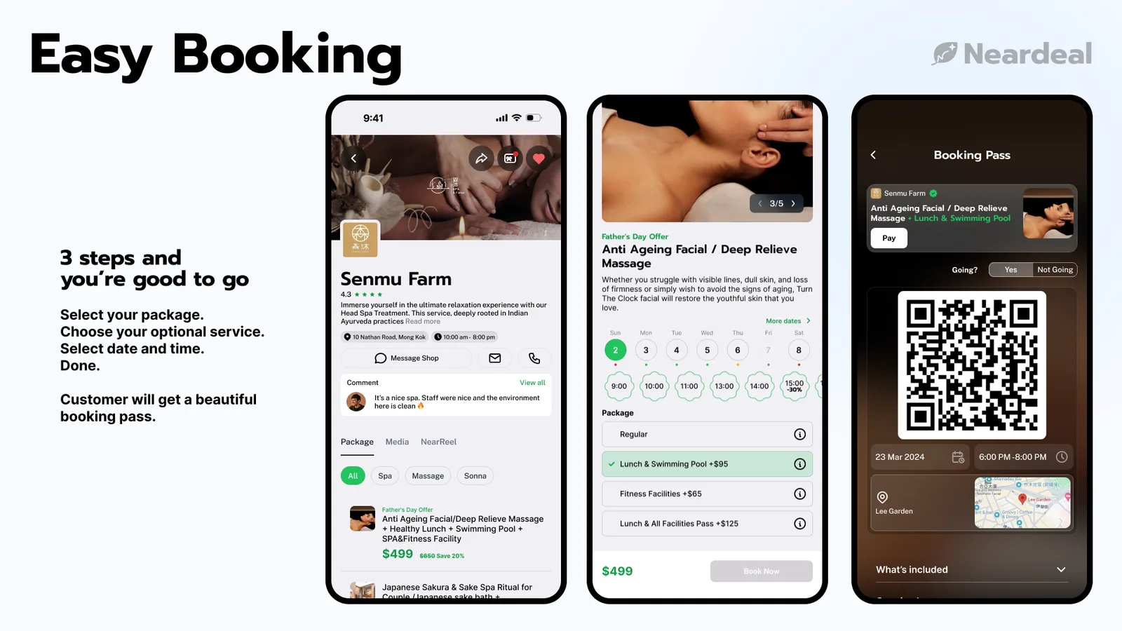
A premium, intuitive interface featuring dynamic pricing algorithms that automatically optimize non-peak hours, maximizing value for users and yield for merchants.
For Merchants
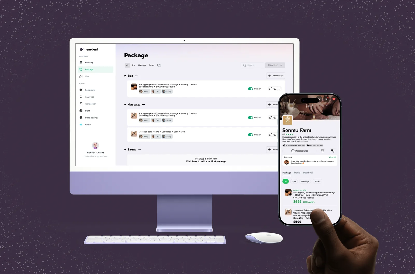
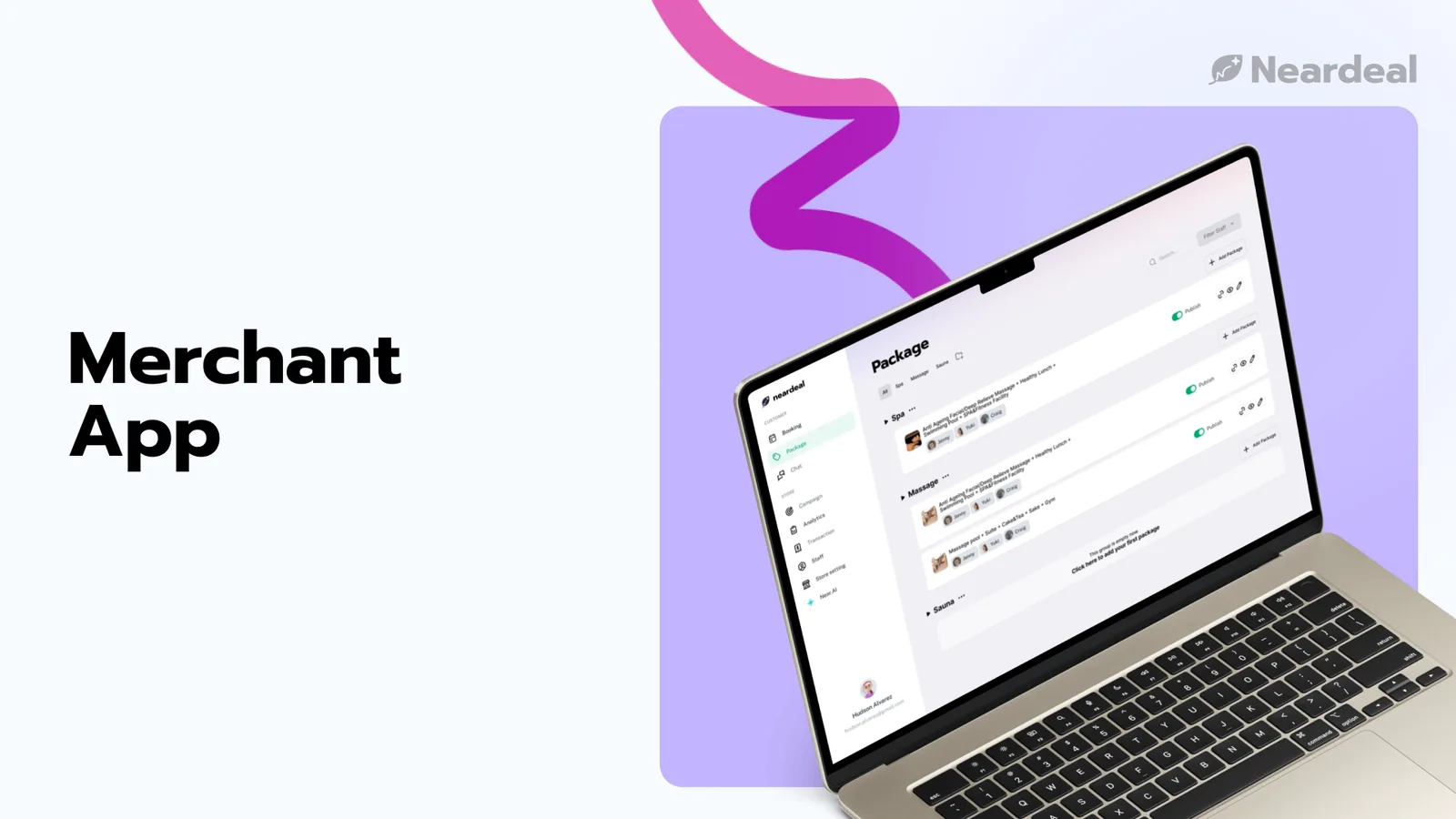
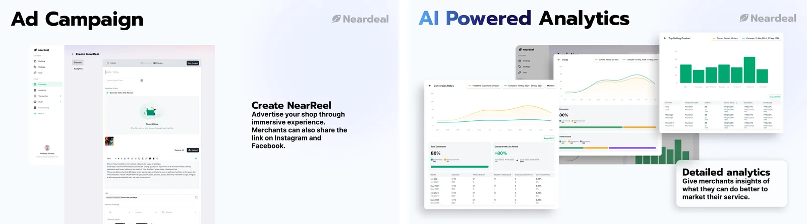
An AI-integrated management dashboard that automates schedule optimization and streamlines marketing operations—leveraging data-backed insights to generate high-conversion package descriptions, alongside smart AI-assisted editing tools to rapidly refine authentic, real-world video content.
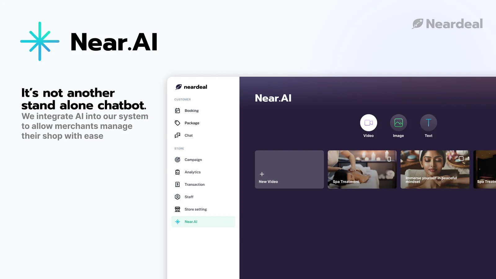
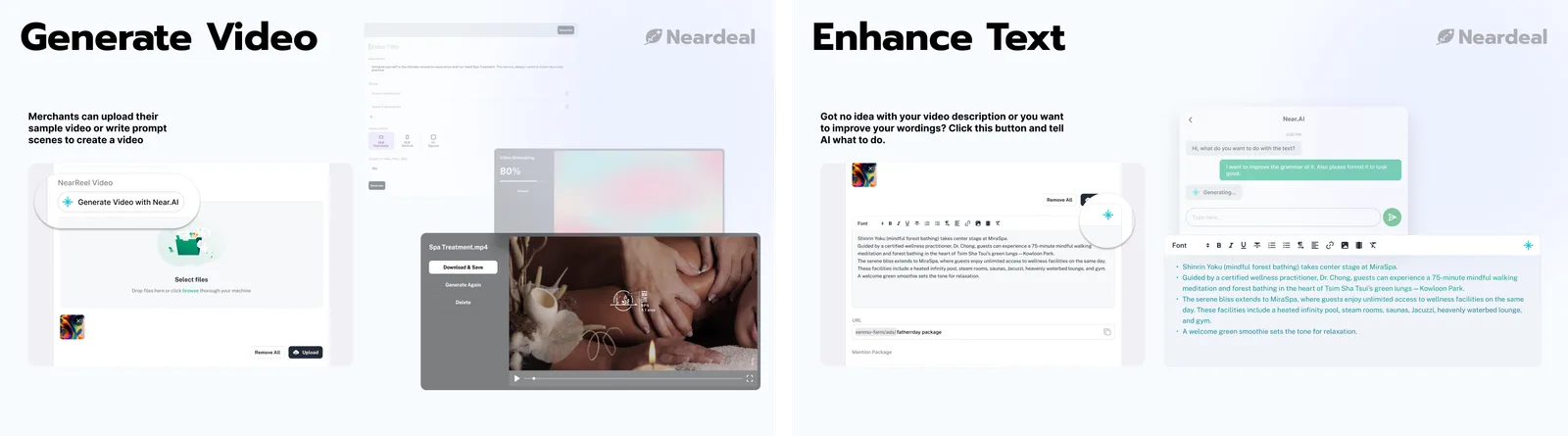
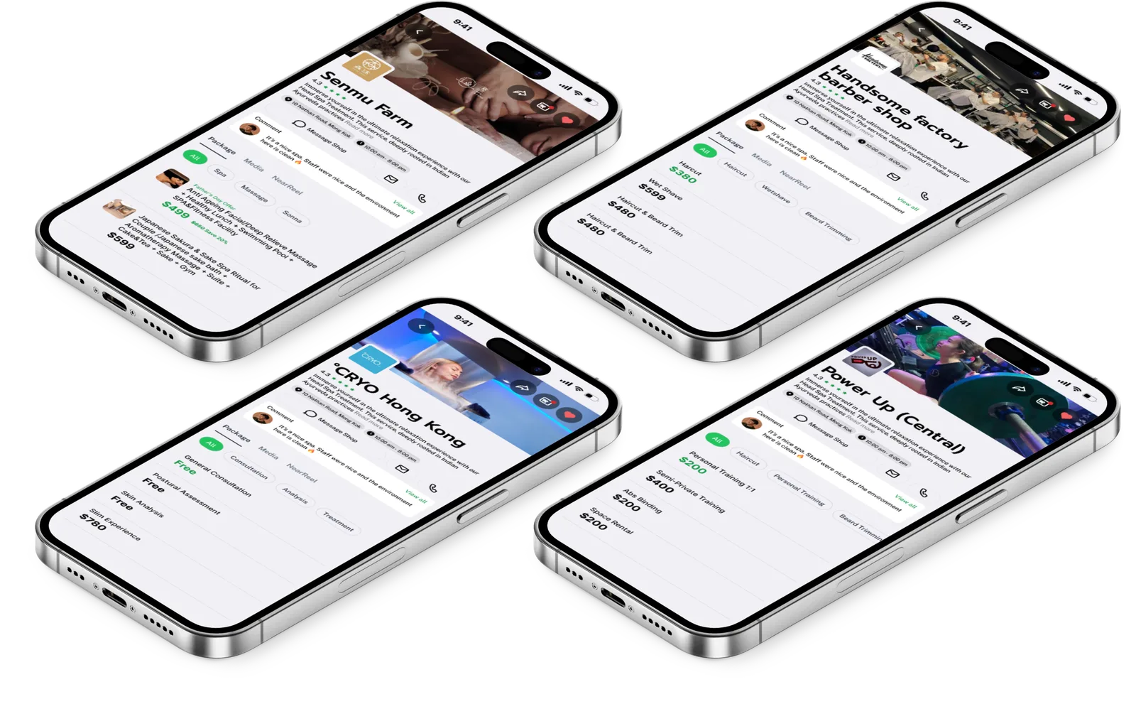
Product Mock-up
User Workflow
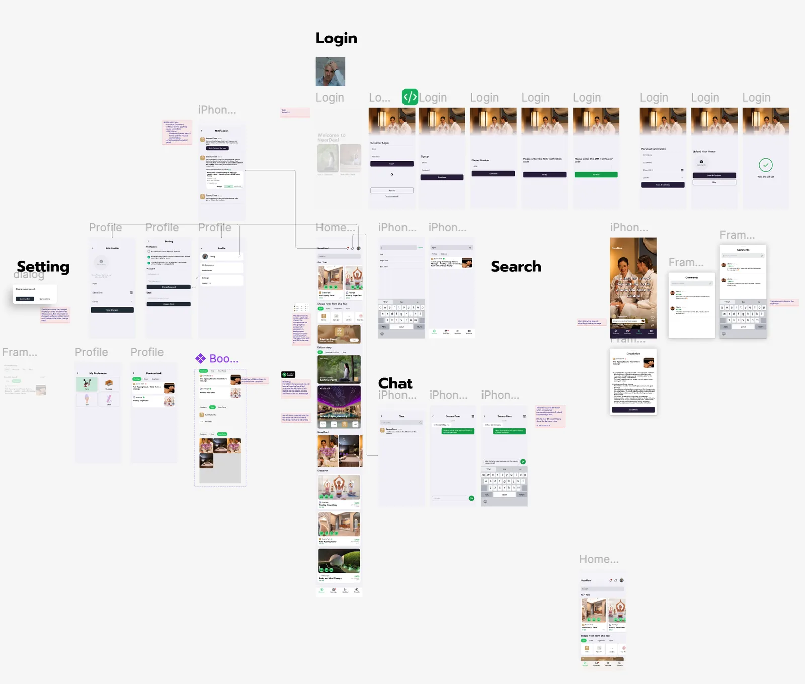
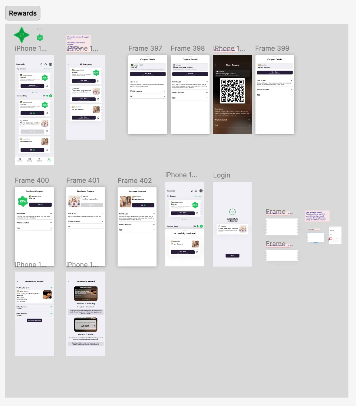
Even though “deal” makes a huge amount of the vision of our app. We still maintain a premium booking platform to match the beauty industry atmosphere. Each button, color, card and animation are crafted to excite user at the first touch. Meanwhile, frictionless design is implemented, like the three step “book first, pay later” approach, aims to increase customer conversion.
Merchant Workflow
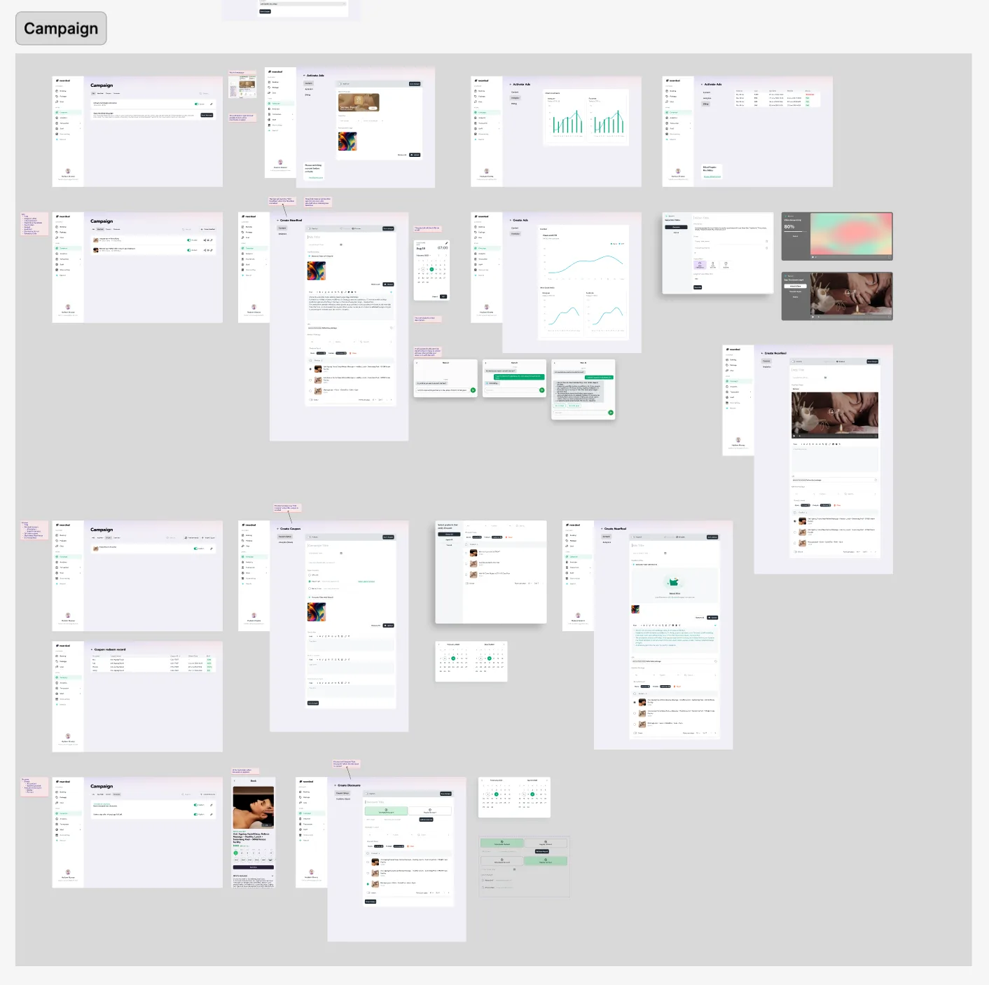
A dashboard design does not mean information should be complex and stuffed inside multiple panels. Clarity matters as most staff does not have a high computer literacy. We need to ensure the app can be self explorative with minimal training and error-free operation. I have carefully handpick the copy-writing and tested with real world user with multiple variations.
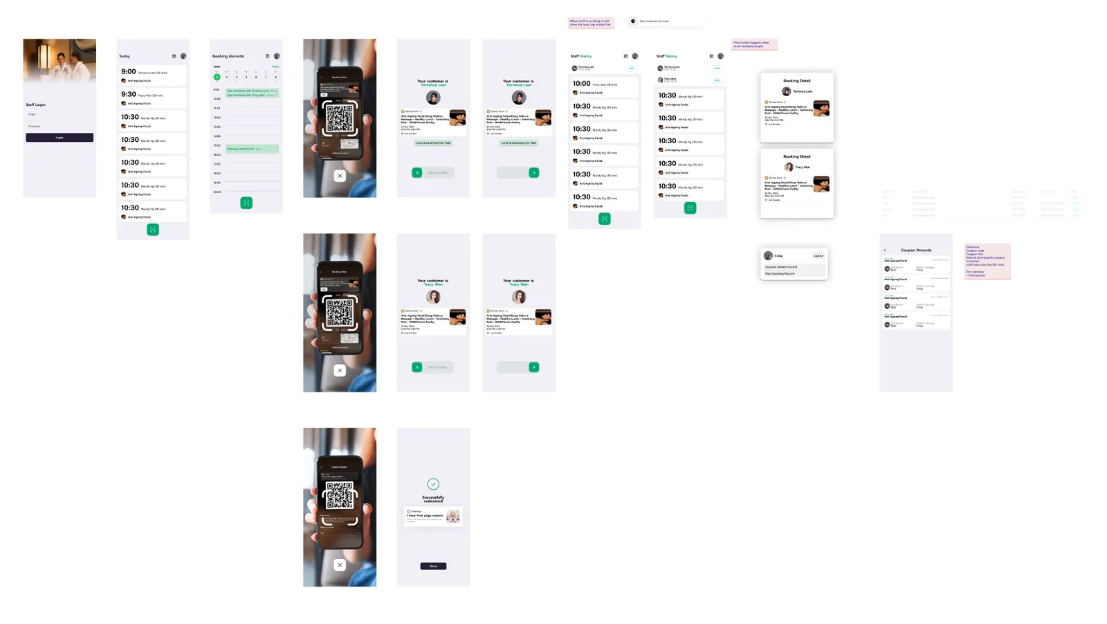
Staff Workflow
I need to ensure the staff app is has all the information at a glance and mistake-free design. Therefore, the home page of the app is distraction free with main action button and large text. Staff will confirm booking with a sliding gesture to prevent misclick.